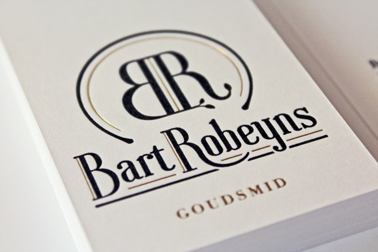
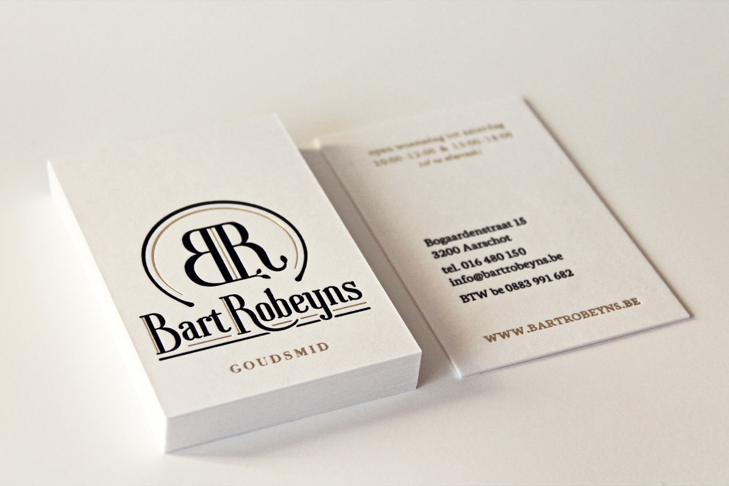
Bart Robeyns is a goldsmith working in Aarschot, who asked me to design a new logo and identity.
He uses mostly natural forms (leaves, branches,...) in his designs, so it came as no surprise that he asked me to look for inspiration in Victorian design.
Since there is a great sense of tradition in his craft, I decided to go for a more traditional letter logo, with a subtle hint of nature in the form of the small leaves at the base of the letters.
The business cards were printed using gold foil – which seemed very appropriate – combined with letterpress.